Hossein Zenderoudi: From Persian Blue to Mediterranean Hues at Raha Gallery Collection
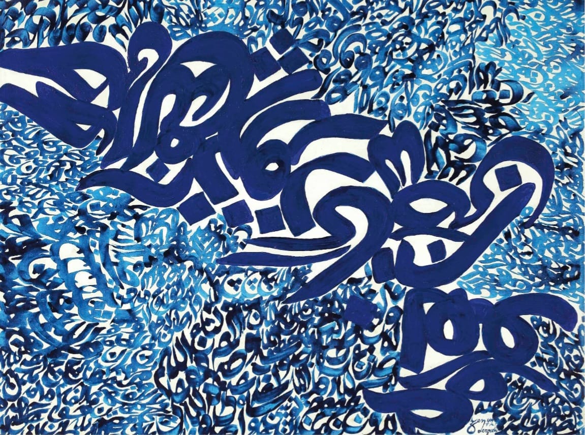
The 53-year-old work Variation Tendre Tourmaline by Hossein Zenderoudi bears a French title meaning “Tender Tourmaline,” a poetic reference to a semi-precious stone. The name infuses the composition with a sense of preciousness and delicacy, enhancing the gem-like quality of its calligraphic lines. The painting is a visual–spiritual experience: letters swirl like particles of energy, inviting viewers to contemplate both meaning and form.
ArtDayMe –Kimia Nakhai : Raha Gallery Middle East, founded and directed by Mohammadreza Ghaemmaghami, has been an active cultural institution for over two decades, devoted to elevating the art of the region. Its holdings include a diverse range of modernist and contemporary masterpieces by Iranian and Arab artists.
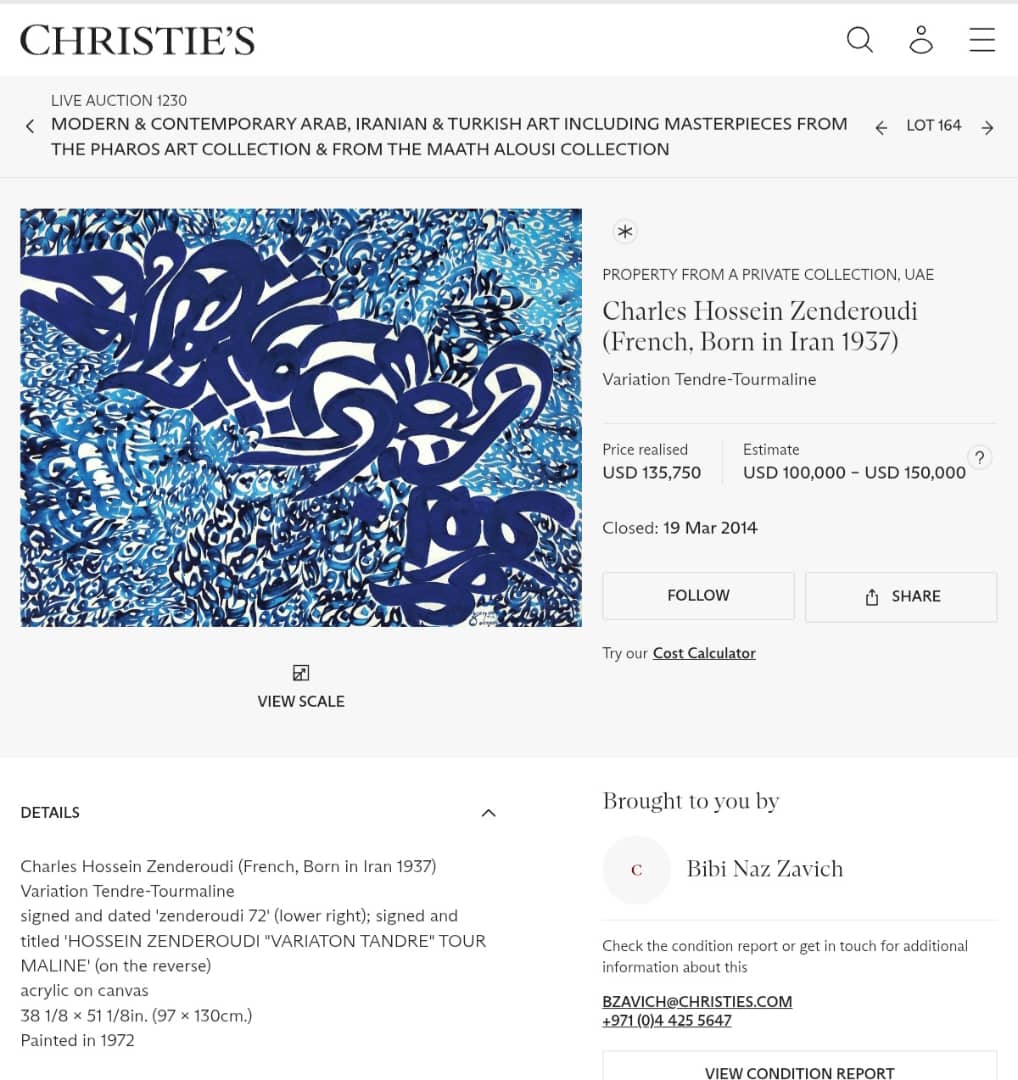
Among these treasures is a 53-year-old work by Hossein Zenderoudi, the pioneering Iranian painter: Variation Tendre Tourmaline, created in 1972 in acrylic on canvas. This remarkable piece was presented and sold at Christie’s Middle East in March 2014.
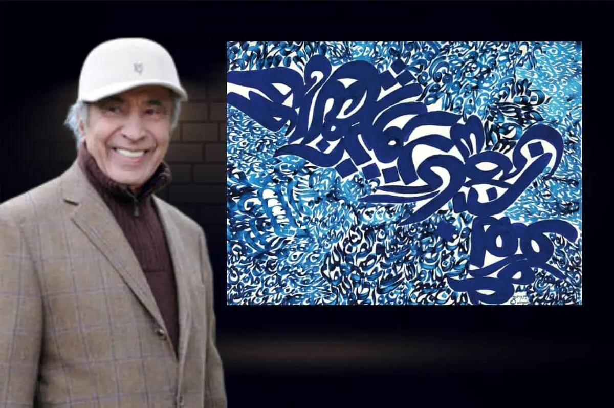
Hossein Zenderoudi (b. 1937, Tehran), also known abroad as Charles Hossein Zenderoudi, is one of Iran’s most influential contemporary painters. He entered Tehran’s School of Fine Arts in 1956, moved to Paris at the age of twenty-two, and won an award at the Paris Biennale in 1961, earning a scholarship. In 1972 he published an exquisite Qur’an with coloured designs through Paris’s Club du Livre, which won UNESCO’s “Most Beautiful Book” prize during the International Book Year. The British Museum honoured him in April 2013. At Christie’s fourth international auction in Dubai (April 2008), his calligraphic painting Chahar Bagh fetched USD 1.6 million, setting one of the highest records for a Middle Eastern artist.
Variation Tendre Tourmaline, preserved in the Raha Gallery Middle East collection, is a landmark example of Zenderoudi’s distinctive reading of calligraphic painting, affirming his place among the great innovators of the genre.
Its overall structure rests on the soft, fluid movement of letters: calligraphy is employed not as legible text but as a visual substance. Letters overlap in different scales, from bold central forms to delicate peripheral clusters, producing spatial depth and rhythmic vitality. White spaces between the dense strokes create visual breathing room, preventing suffocating density. The work radiates a quiet tenderness, underscored by the choice of the French title, which adds a poetic touch to the “jewel-like” character of the script. The composition becomes a meditative journey, where letters spin like luminous atoms.
From Persian–Islamic Blue to Mediterranean Blue
The colour palette is one of the work’s strongest expressive components, shaping its entire mood. Built on a restrained spectrum—turquoise, medium blue, ultramarine, and navy, set against the white of the canvas—it dispenses with warm hues to focus on the inner resonance of blues.
• Dark/ultramarine blue anchors the main script, giving the composition stability and visual weight.
• Mid and light blues weave through finer layers, adding vibration, lightness, and a sense of motion.
• The white background is not passive; it frames the letters, allowing the colours to “breathe” and creating a radiant contrast, as if light emanates from within the lines.
In Persian and Islamic culture, blue evokes the sky, infinity, spirituality, and serenity. Lapis and turquoise, long used in tilework and architectural ornament, echo an unconscious memory of the East. The cool palette fosters calm and contemplation, while the density of the darker tones injects energy and dynamism. The range—stretching from turquoise to deep navy—imbues the canvas with freshness and transcendence. The interplay of brush rhythm and layered blues lends the painting both an Eastern and Mediterranean character.
The central bold strokes resemble a broken, Thuluth-like calligraphy, repurposed for pictorial expression and partly freed from legibility. Around them, micro-clusters of repeated letters build a texture reminiscent of Islamic invocations or litanies, infusing the surface with a spiritual undertone. By transforming script into a decorative and metaphorical element, Zenderoudi dissolves the boundary between text and image.
Brushwork reveals the artist’s physical presence, while layered pigments enliven the surface. Acrylic allows for luminous, quickly-drying blues that maintain clarity. Created during the height of Zenderoudi’s 1970s “calligraphic painting” explorations, the work reflects his dialogue between tradition and modernity. It also belongs to the illustrious “Paris School” phase of his career, marked by the convergence of Western modernism and Islamic calligraphy.
Its sale at Christie’s Middle East (2014) underscores the global resonance and market for Iranian calligraphic painting. Through the harmony of script, colour, and space, Zenderoudi forged a language that is both visually captivating and intellectually engaging. Blending the heritage of calligraphy with modern painting, he created a unique statement that continues to inspire contemporary artists.
In this work, Persian–Arabic script becomes the very essence of painting, merged with a poetic spectrum of translucent blues to craft a mystical yet modern experience. The canvas stands as proof of the artist’s ability to traverse the boundaries of tradition and modernism, securing his stature as a pillar of Middle Eastern calligraphic art.
This masterpiece belongs to the Raha Gallery Middle East collection.
LEAVE A RELPY